Macau Business is a flatted factory floor reprogrammed into a news agency. To shape the empty space, we applied lessons learned about corridors, in-between spaces, people flow and overlapping of functions to the dynamic environment of an office, where the program was more complex than an apartment or a lobby. This project stands out because it applies the same strategy of design through the composition of volumes that we used in House in a Flatted Factory, while our application of the lesson learned through designing the void space for C&C Lobby represents a departure. Here, the volumes lose the regular, minimalistic, prismatic shapes they had in House in a Flatted Factory and adapt to a desire to shape the space of the empty areas. By designing a free-form volume we create interdependence in the design between mass and void. The volume is also dematerialised through the use of visual separations that are not solid walls, and allow for its flexibility of use.
The client brief was for three independent offices, a reception/secretariat, an independent separate area for the journalists, an open space for the graphic designers and other editorial staff, a large-sized media room and a pantry. The journalists’ independent area was supposed to be a hot-desk type of space, mostly used at the end of the day.
The space is rectangular, with windows only on one of its short sides. Thus the program would have to be located mostly in windowless interior space. In order to make use of as much natural light as possible, we placed the three independent offices along the façade, but created semi-transparent screens as separation in order to let light pass through to the inner spaces.
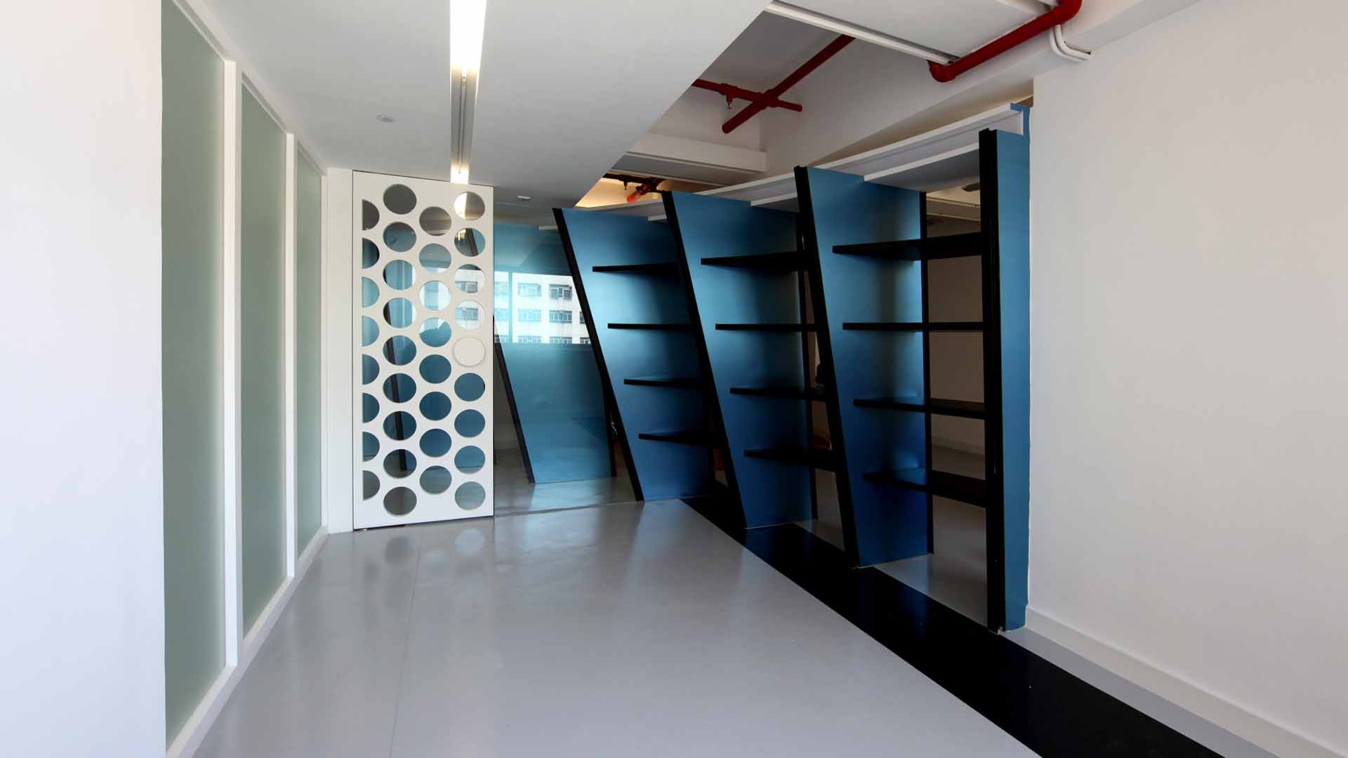
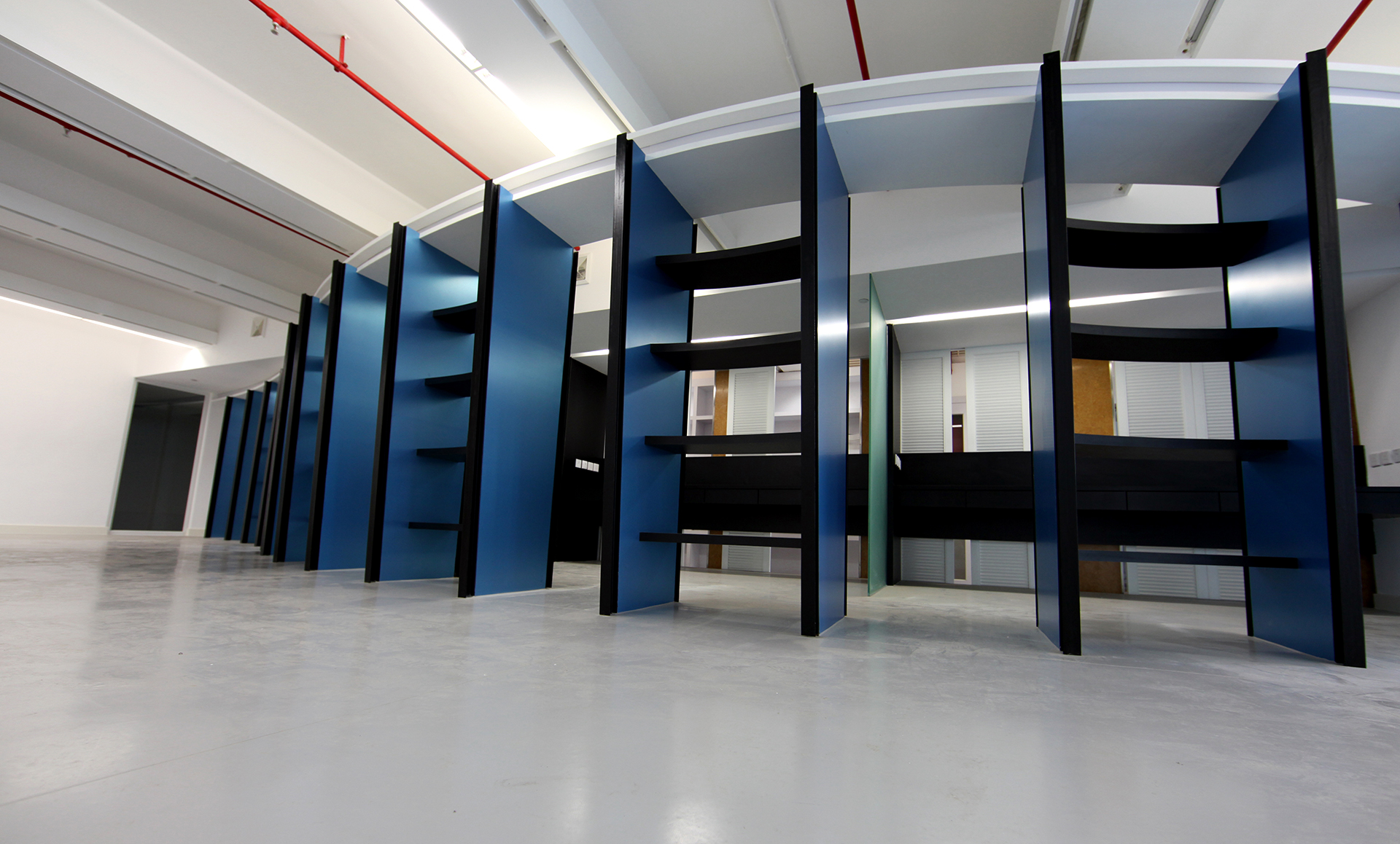
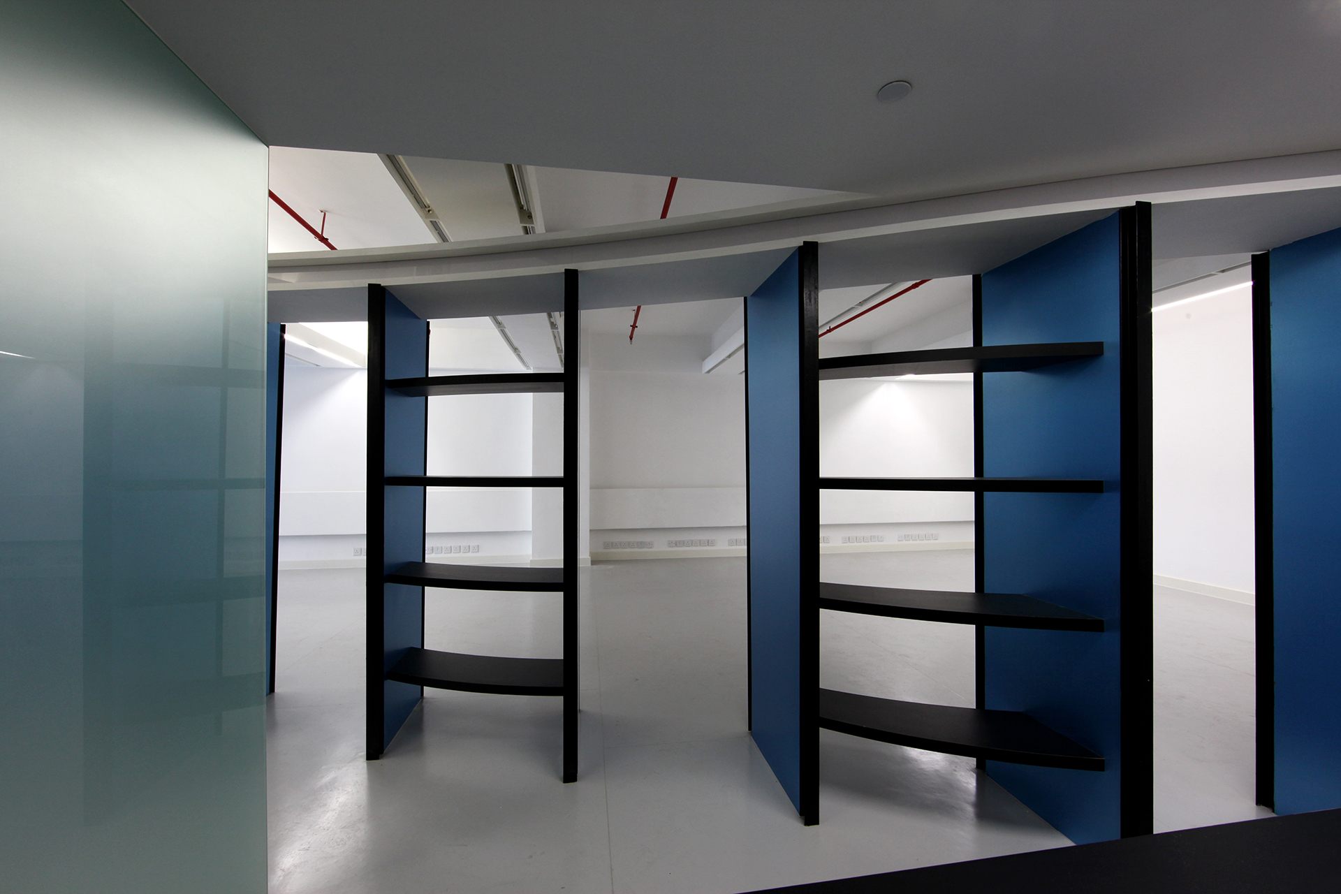
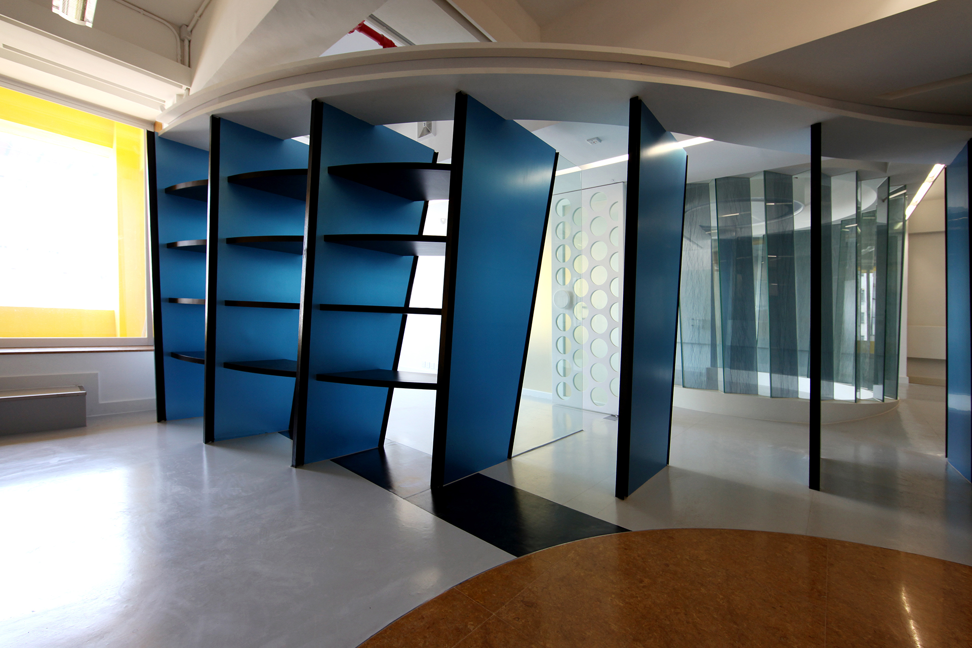
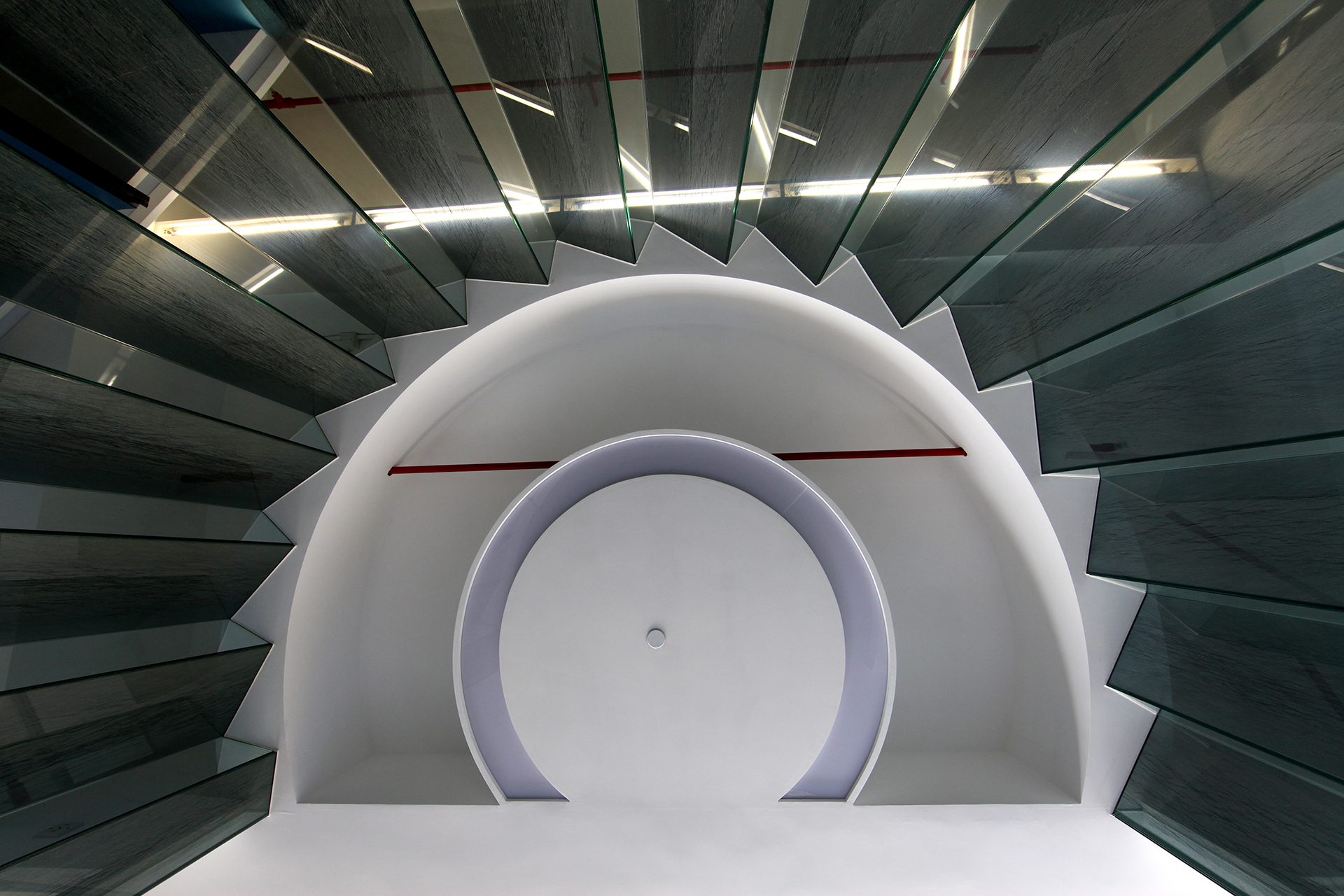
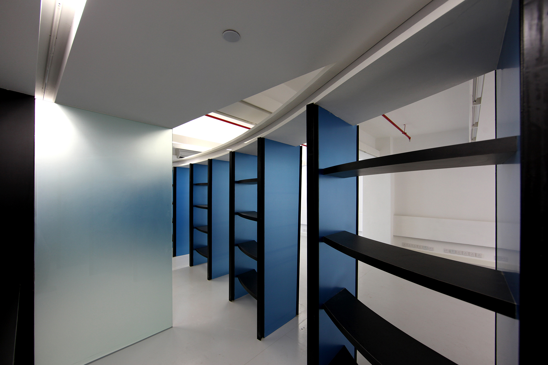
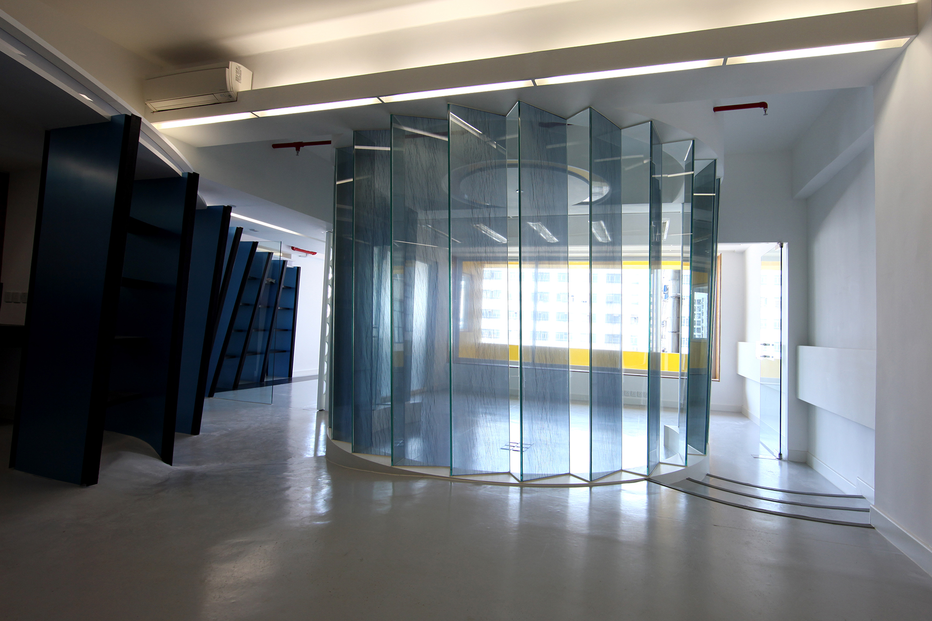
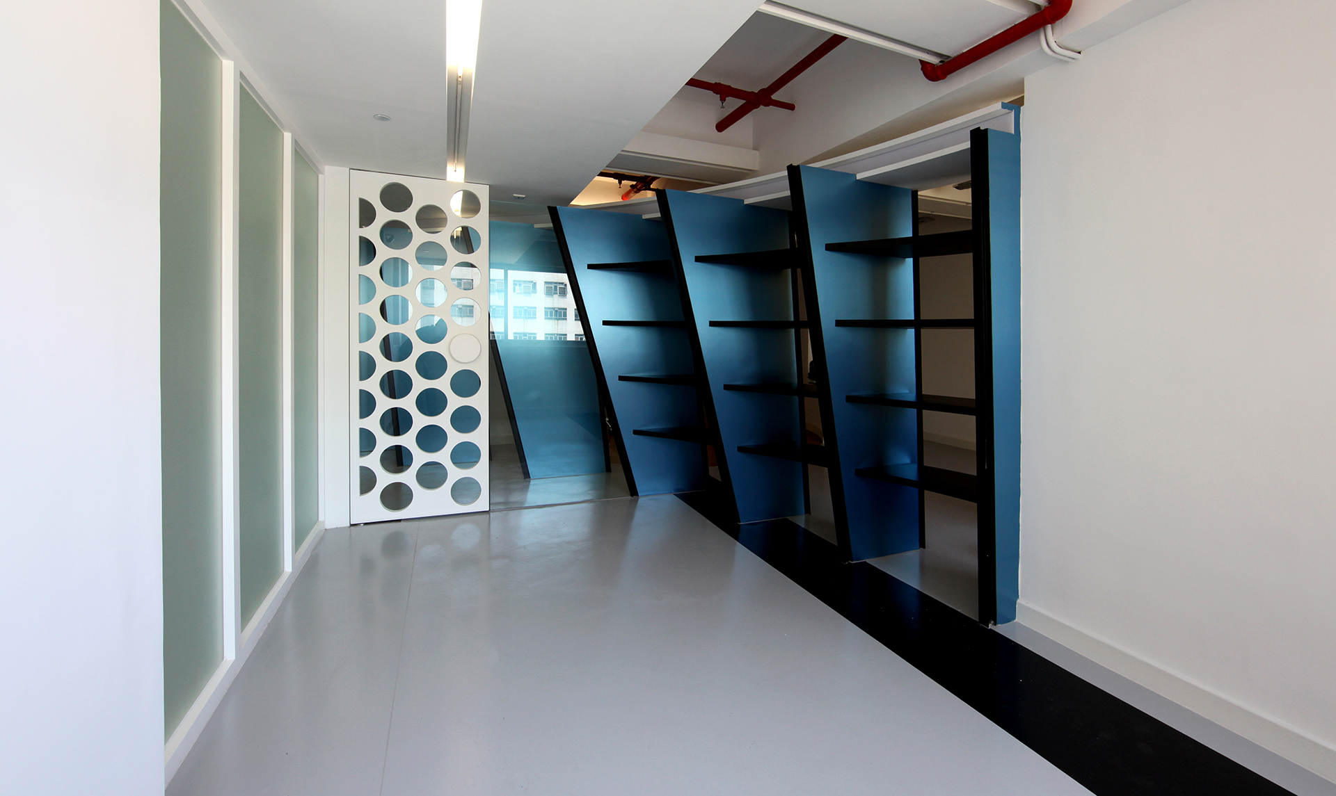
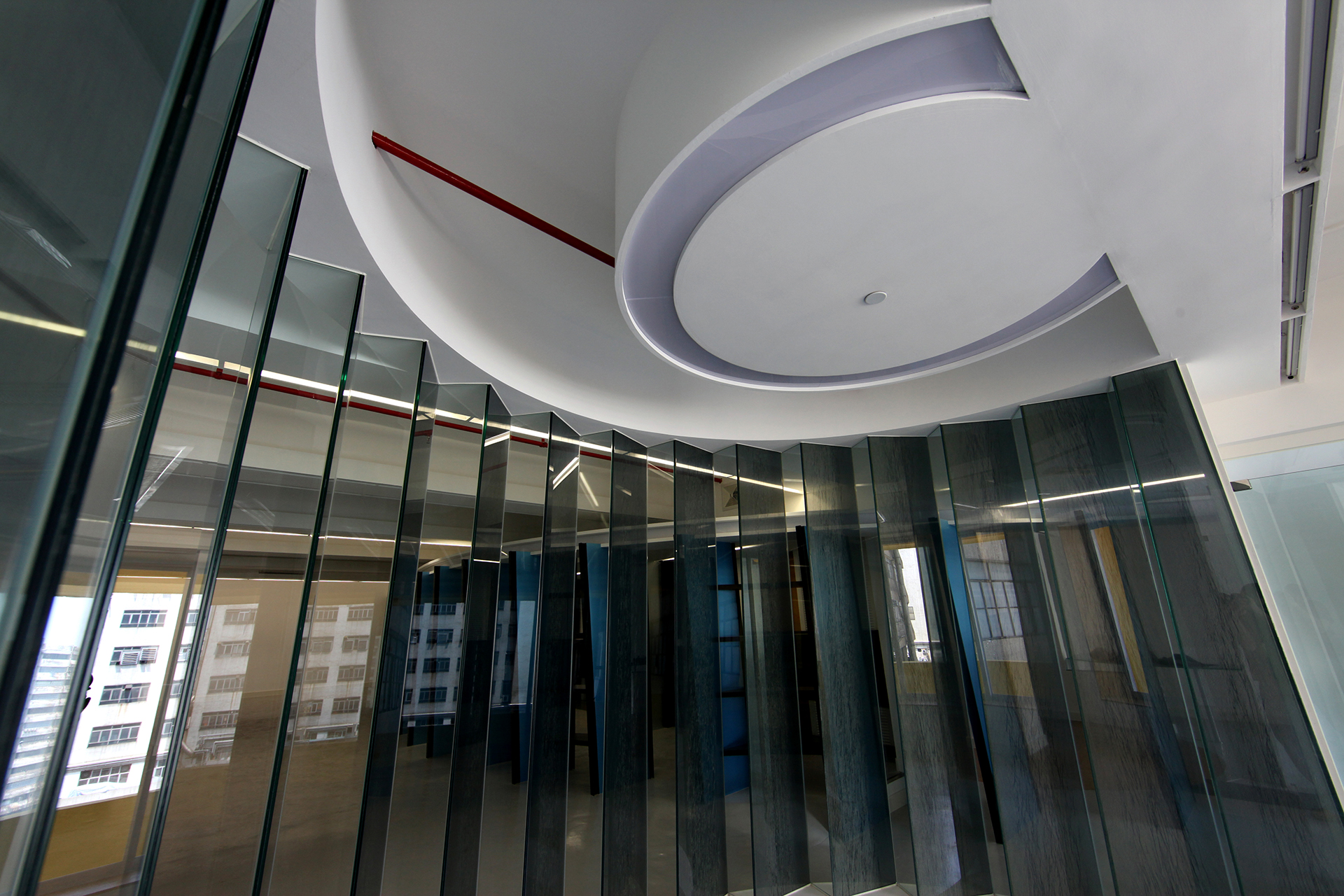
We decided to make use of the separate journalists’ area with the hot desks to design an independent volume placed in the middle of the space – not unlike what we did in House in a Flatted Factory – which would help separate the working areas from the circulation areas. This volume contains very small offices, therefore we opened its wall facing the corridor and added sliding windows over the desks so that each journalist would be able to talk with the rest of the staff using the circulation area without having to leave his or her desk. The circulation space thus becomes a communication space. The rear of this volume is curved, designed with vertical pieces that are the posts of a bookshelf with openings that allow access to the offices, resulting in a volume with a porous back side. The bookshelf screen acts as a threshold between the open office space of the company and the private working space used by the journalists.
In this design, we experimented with informal partitioning, from semi-transparent to semi-opaque. The director’s office is designed as a room with a circular extension that is a shared meeting area defined by a semi-transparent glass wall that is a sandwich of silk cloth in between two glass panels. The other office features a wooden door that is punctured by big round holes, and thus is semi-opaque. Similarly, the journalists’ offices are open on both sides, on one side with sliding partitions towards the corridor to maximise personal interaction between the staff, and on the other through the wave-like bookshelf at the rear, which opens every now and then towards the production area.
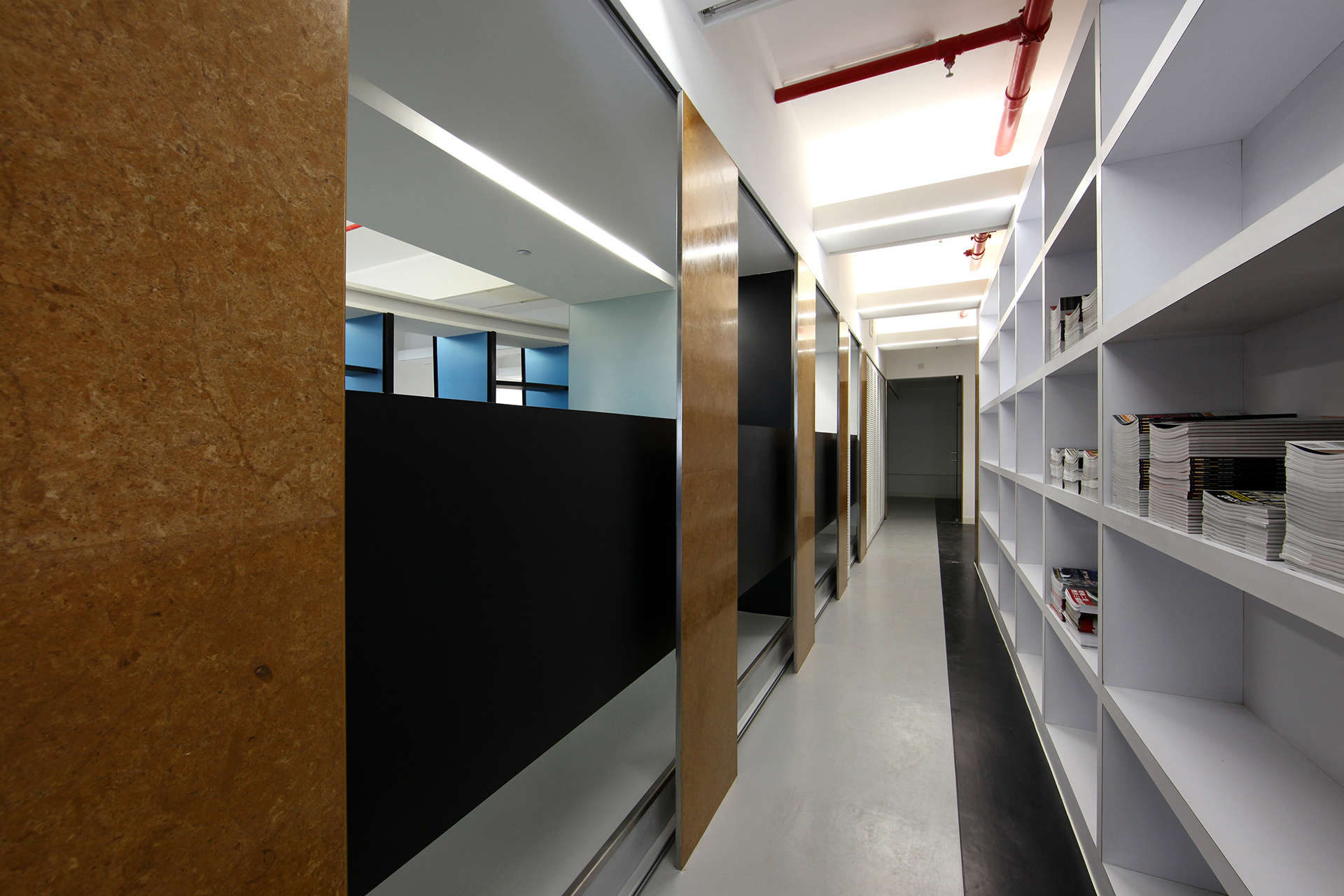
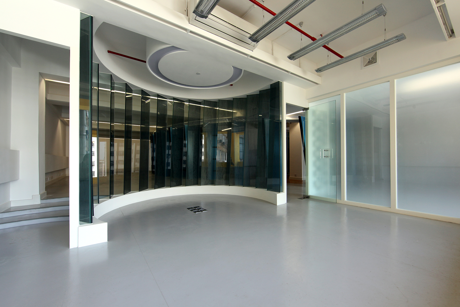
The volume acts as a separation between the circulation area and the office open space. The circulation area is connected to the entrance and the reception; it dialogues with the journalist’s hot desks through a set of windows and, similarly to House in a Flatted Factory, features a widening that allows for extra space for the informal area of the pantry, the storage entrance and the toilet area.
We also made use of a difference in level that, in this case, is not practical but just a spatial device, a threshold, for the separation between the main office spaces and the open area, and also serves as a strategy to increase the view of the window from the back side of the floor.
This project taught us that in addition to designing spaces through the composition of volumes, we can also shape the volumes in such a way that they influence the shape of the void space as well. This technique is a subversion of the typology of interior design schemes where the spaces are separated by walls and doors. In this example, spaces are organised and separated by the placement of volumes and the thresholds are defined by changes in the size and scale of connectors, giving fluidity and logic to the whole design: the logic of connectivity, perspective and phenomenology. This is a strategy of breaking the barrier between what is solid and what is empty. It goes beyond the definition of the wall as a limit. It is a mass-versus-void relationship.
This is another example, as stated at the beginning of the chapter, of the interrelationship between mass and void: you can place a mass within a fixed volume and the two will mutually shape each other.
 PREV
NEXT
PREV
NEXT